
I needed to revamp the color palettes to better suit the design system. I was allowed to trim down the primary and secondary palette to meet WCAG standards, however, the extended palette and guidelines for data visuals were explored but not established. So I took it upon myself to complete the project.
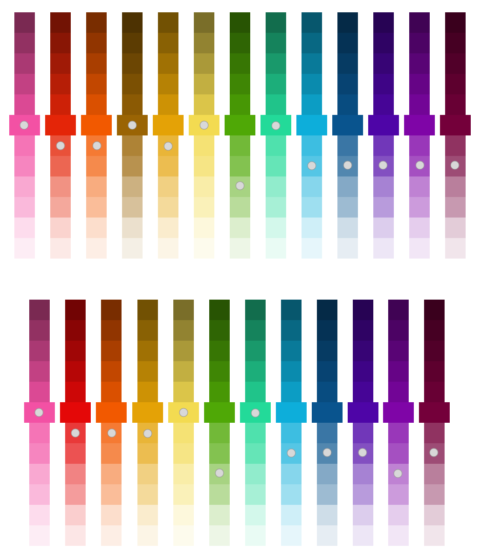
Below are the explored colors that I was given to work with. Some concerns were:
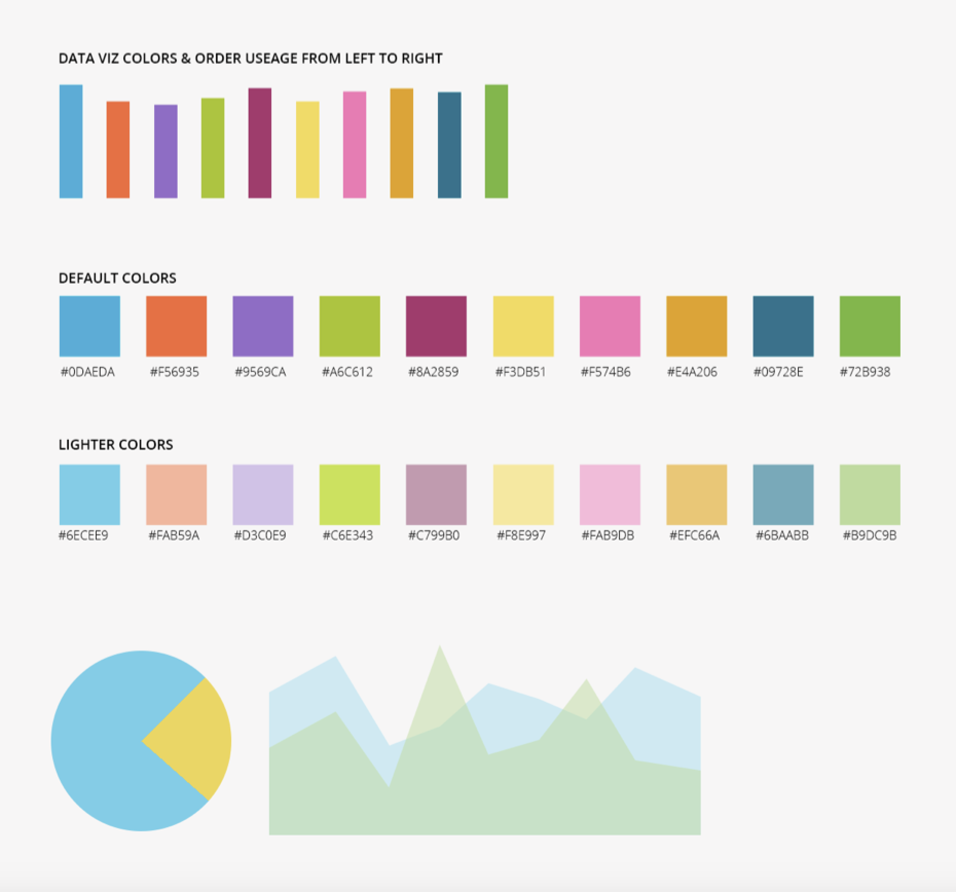
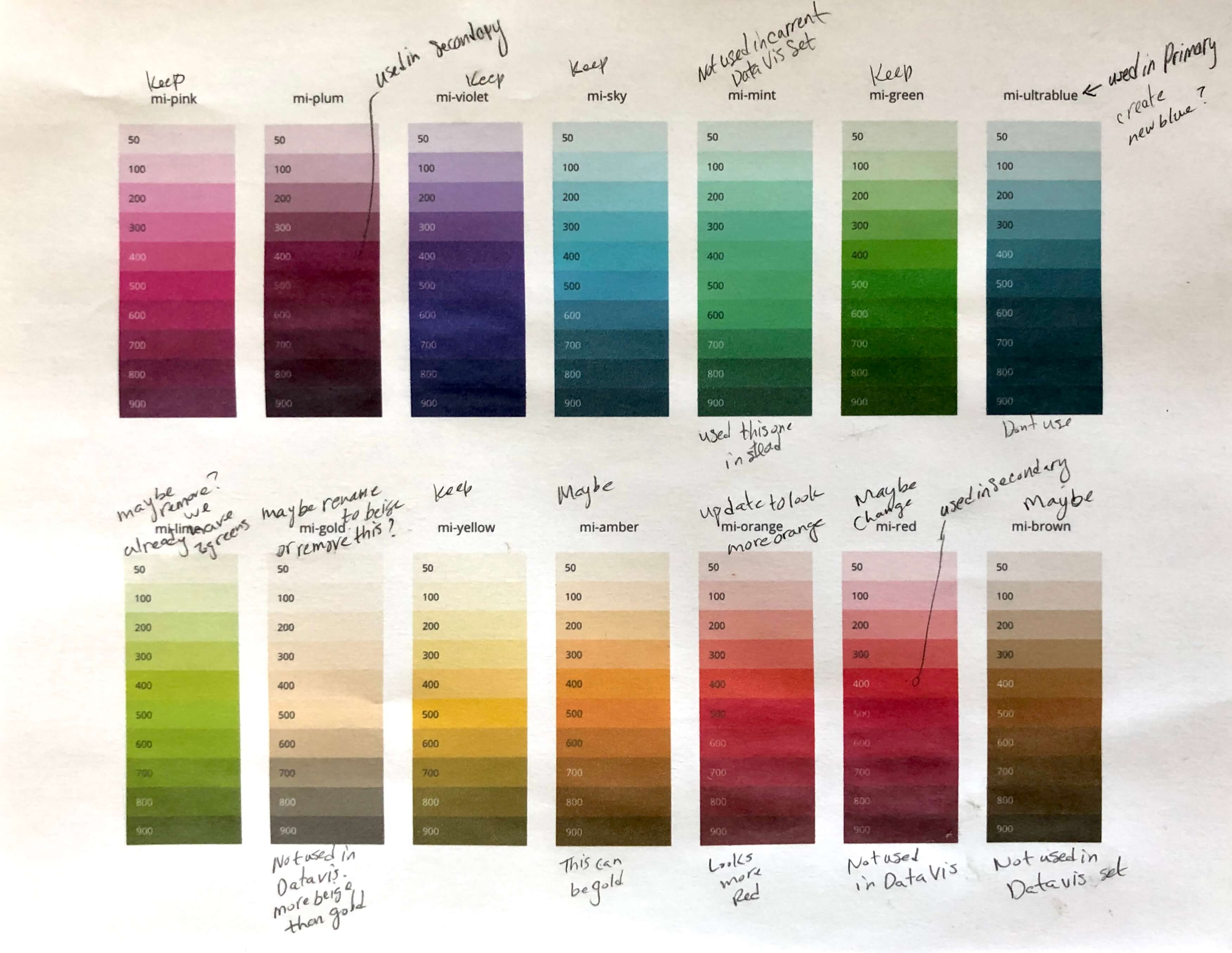

The 10 colors provided to me are the colors being used in our products for data visualization. The color order from left to right was created to support red-green color blindness. (The niche client at the time were males; mechanics or employees working in Property & Collision and red-green color blindness is the common color blindness among males.)
As you can see from the visual audit in color blindness view there are some discrepancies; some colors lack contrast and looked similar.
Using stronger hue colors from the explored palette, I created more of a defined contrast as a baseline for data visualization colors.
I then added two additional colors to create a total of 12. (The majority of data measured in our products are time frames values such as hours, months, and years. Therefore, 12 colors was settled to accommodate the twelve a.m. and p.m. hours in a day and months in a year.)
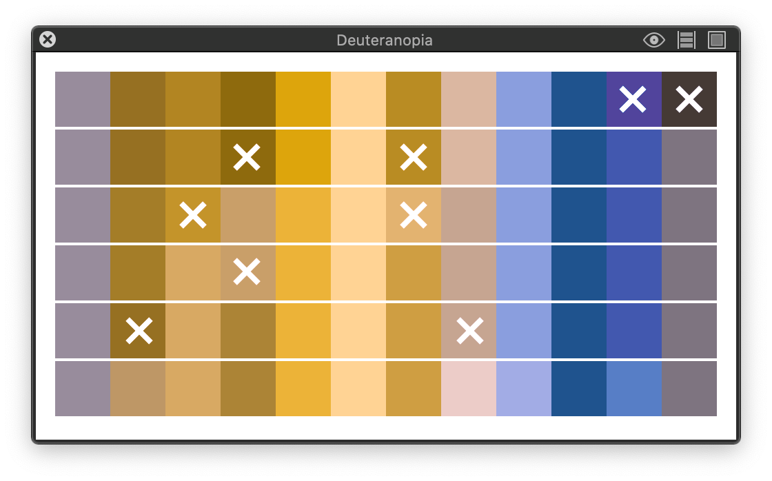
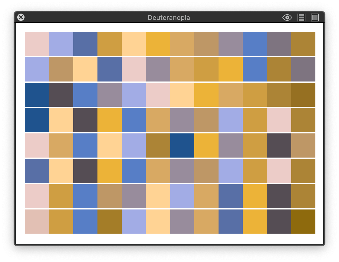
Color order was then explored to help provide a more striking yet cohesive contrast. (I dubbed the blues from the color blindness chart as "cool" and oranges "warm".) The new color order made the warm and cool colors unbalanced.
To balance out the colors, the next step was to explore a new "cool" color and to remove a "warm" color.
An additional purple was created for "cool" and brown was removed from the "warm" palette.
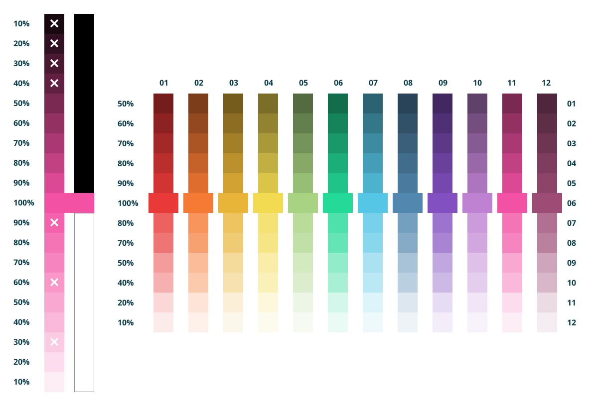
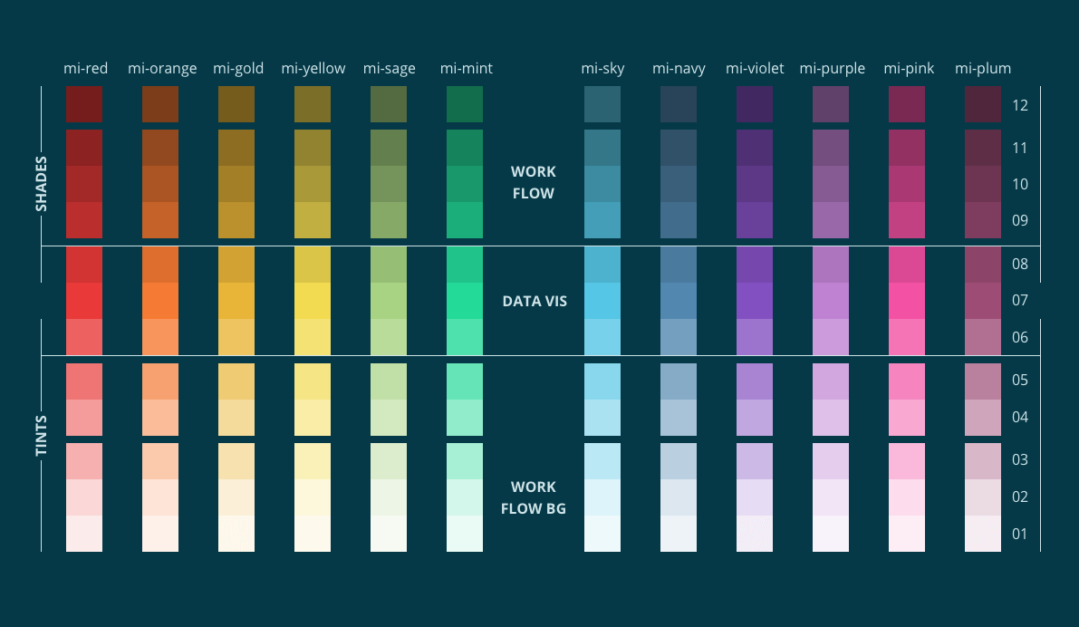
The new baseline colors were then realigned. All new base colors had a new tint and shade spectrum created.
The "warms" and "cools" were rearranged to ROYGBIV for normal view, which helps create a warm to cool palette in colorblindness view.
If in the future additional colors need to be created, the spectrum bar on the left shows how I created the tint and shade spectrum.

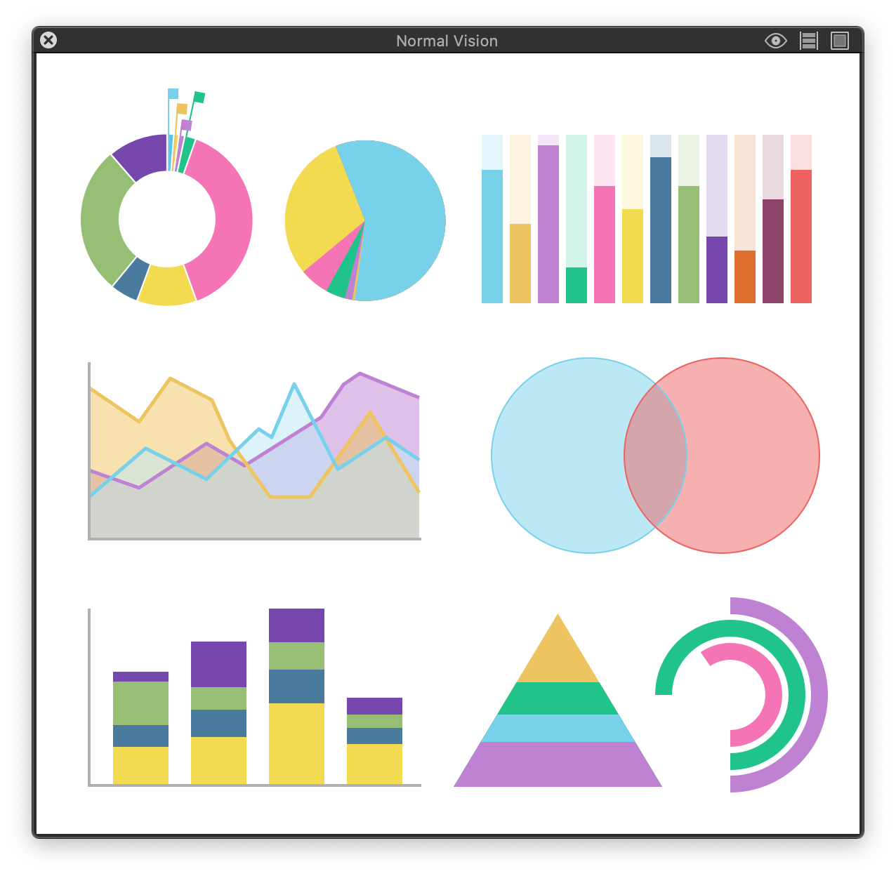
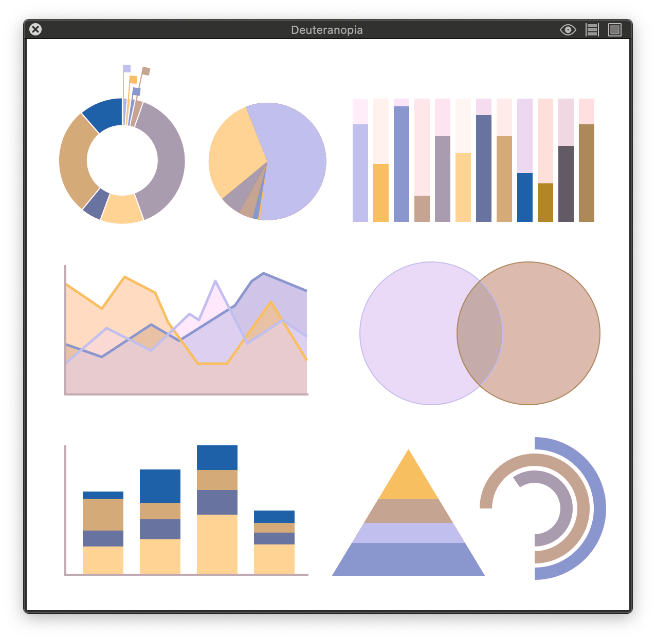
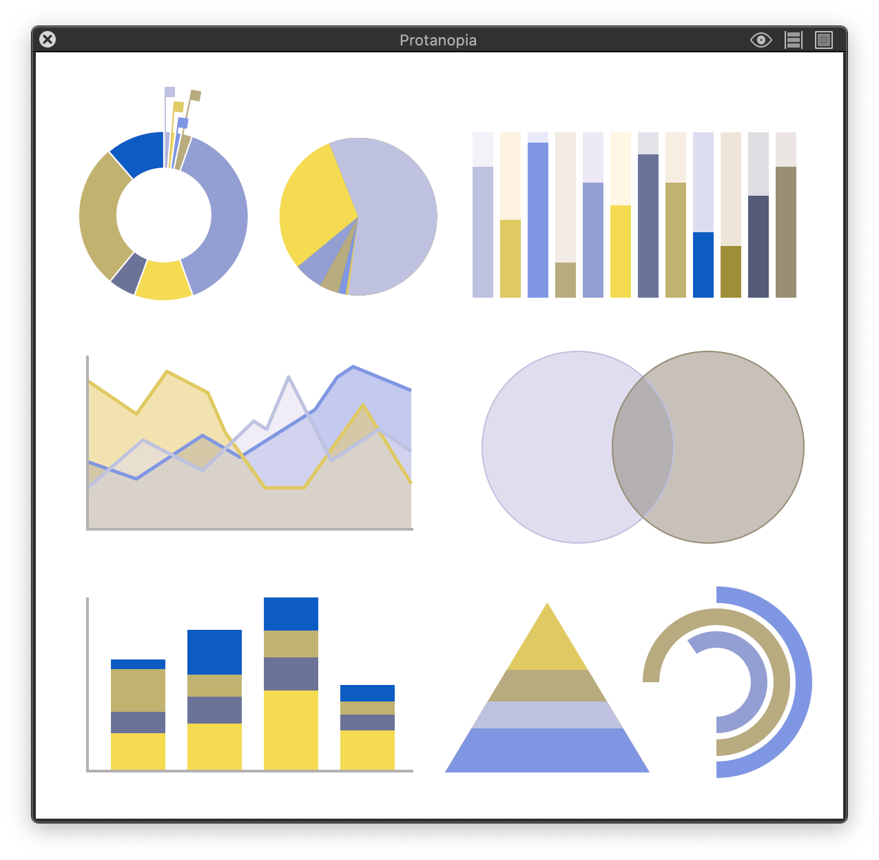
Ok we got the colors and the order we want them in. Now lets check it in common red-green colorblindness; deuteranopia and protanopia. Then check to see it in context of data visuals. Then present the colors to the design systems team and the rest of the design team to check and review it. Afterwards place it in context with our products so stakeholders can check and provide feedback, too.
The concerns from the teams were objective class and naming convention decisions. The stakeholder concerns were subjective, as in aesthetics, "They look like easter colors.".
For naming, a decision was made to temporarily use hex codes for upcoming data visualization until the teams comes to a consensus, then we'll add them to the design system. To address the color concerns, the data visual colors section were expanded to 3 rows within the palette to help create darker or lighter palette alternatives.
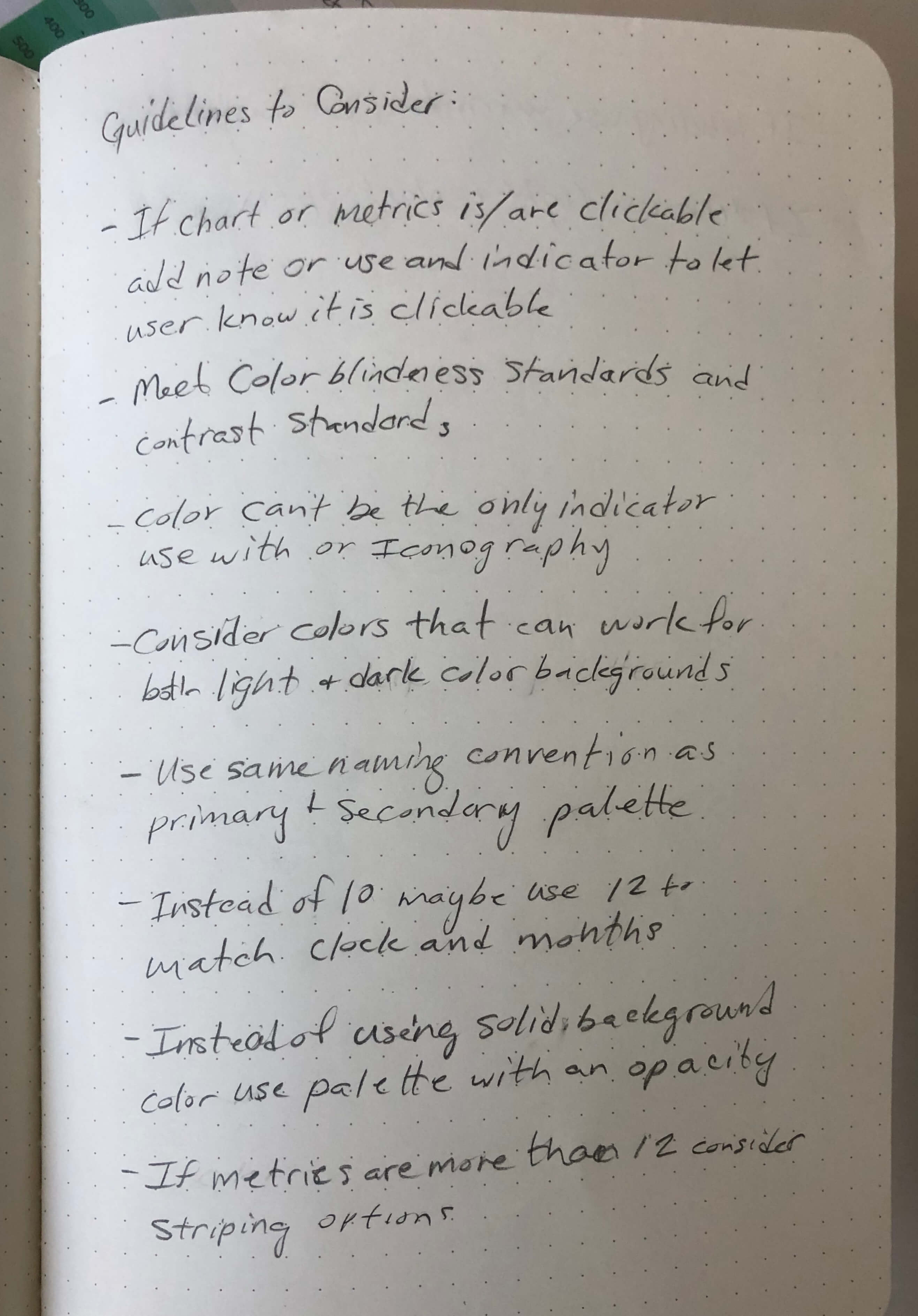
There are other color blindnesses such as blue-yellow and monochromacy and from the beginning it was understood that we may not meet all color blindness and color contrast guidelines. To help alleviate this, the extended palette color guidelines were created and is constantly being updated.
Below is a small sample of guidelines:
Creating a cohesive and accessibility friendly color palette was and still is a challenge. I learned a lot and came across a few good resources along the way. One good article to read is Finding the right color palettes for data visualization. I also recommend Sim Daltonism, it's a free app that helps simulate color blindness.
Note: Not long after I left the company the Accessible Canada Act was passed. I was fortunate enough to complete this project prior to the passing.